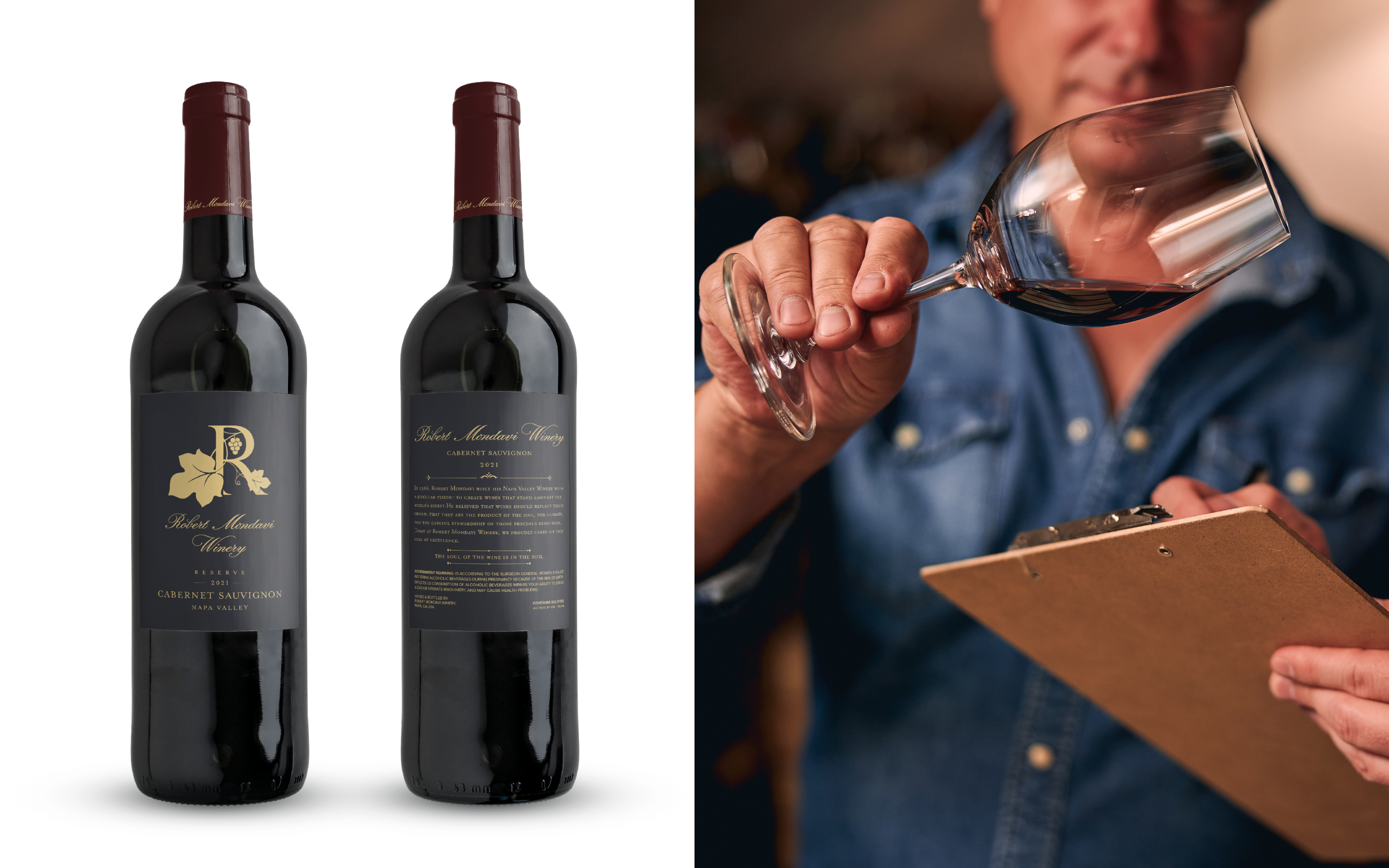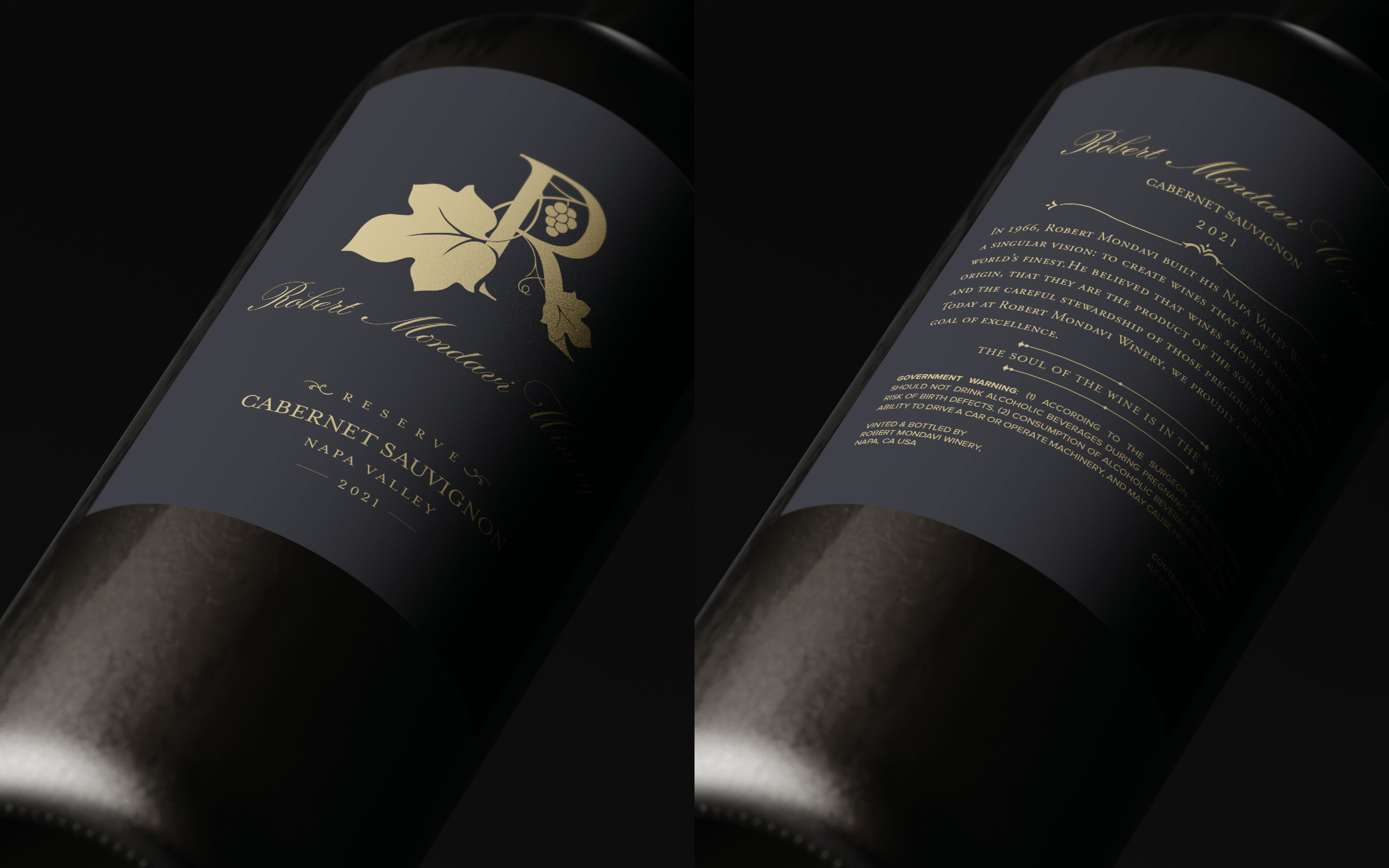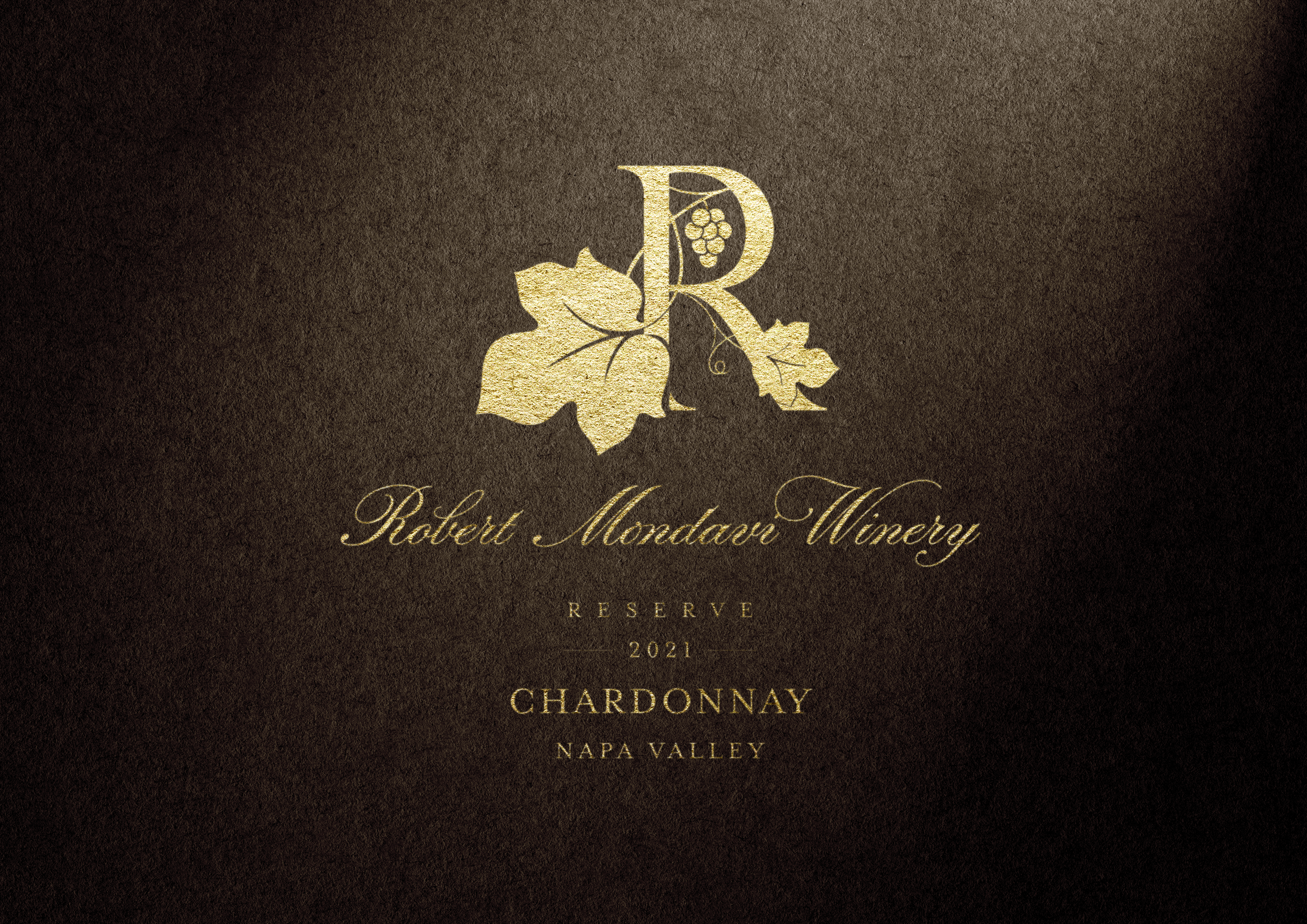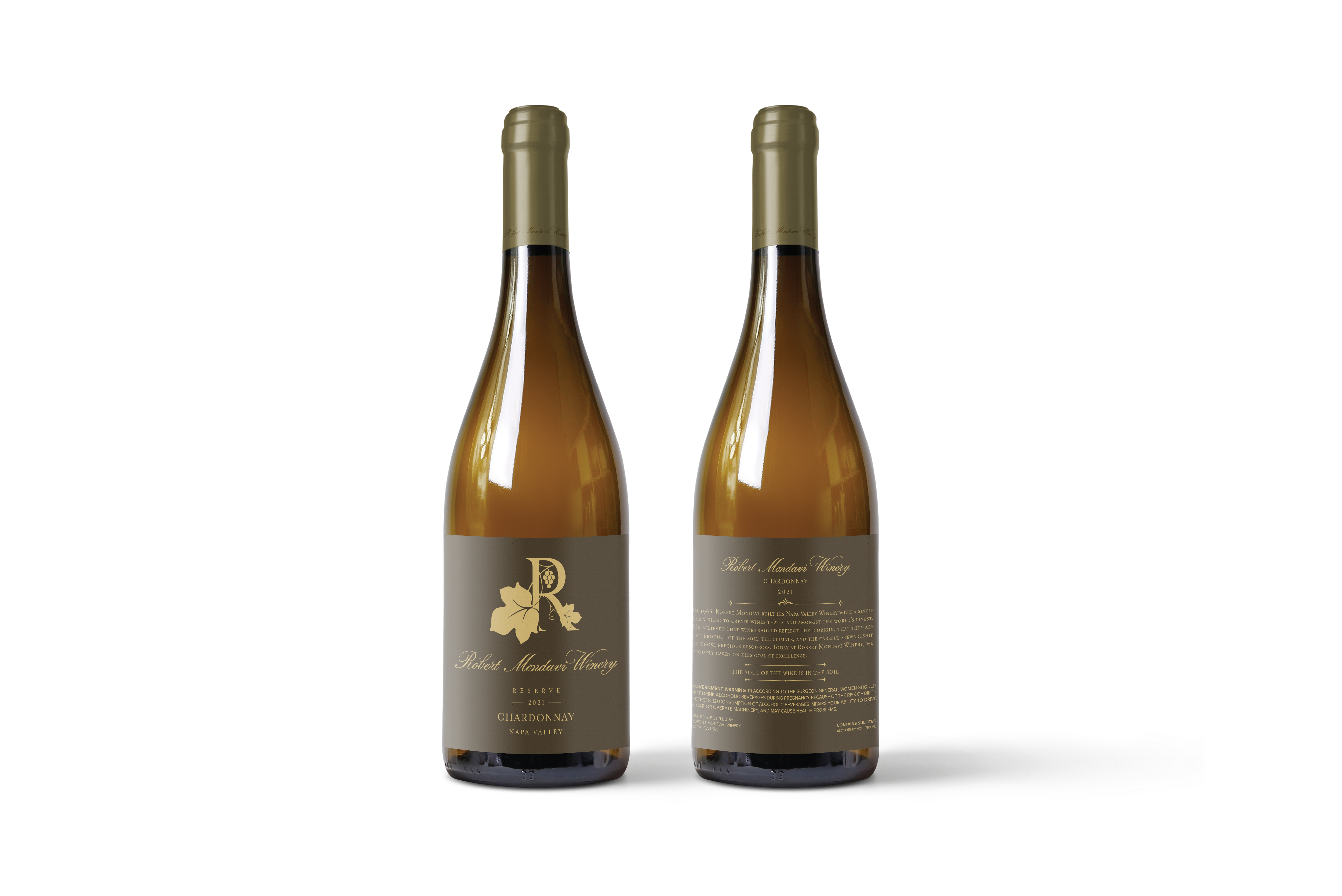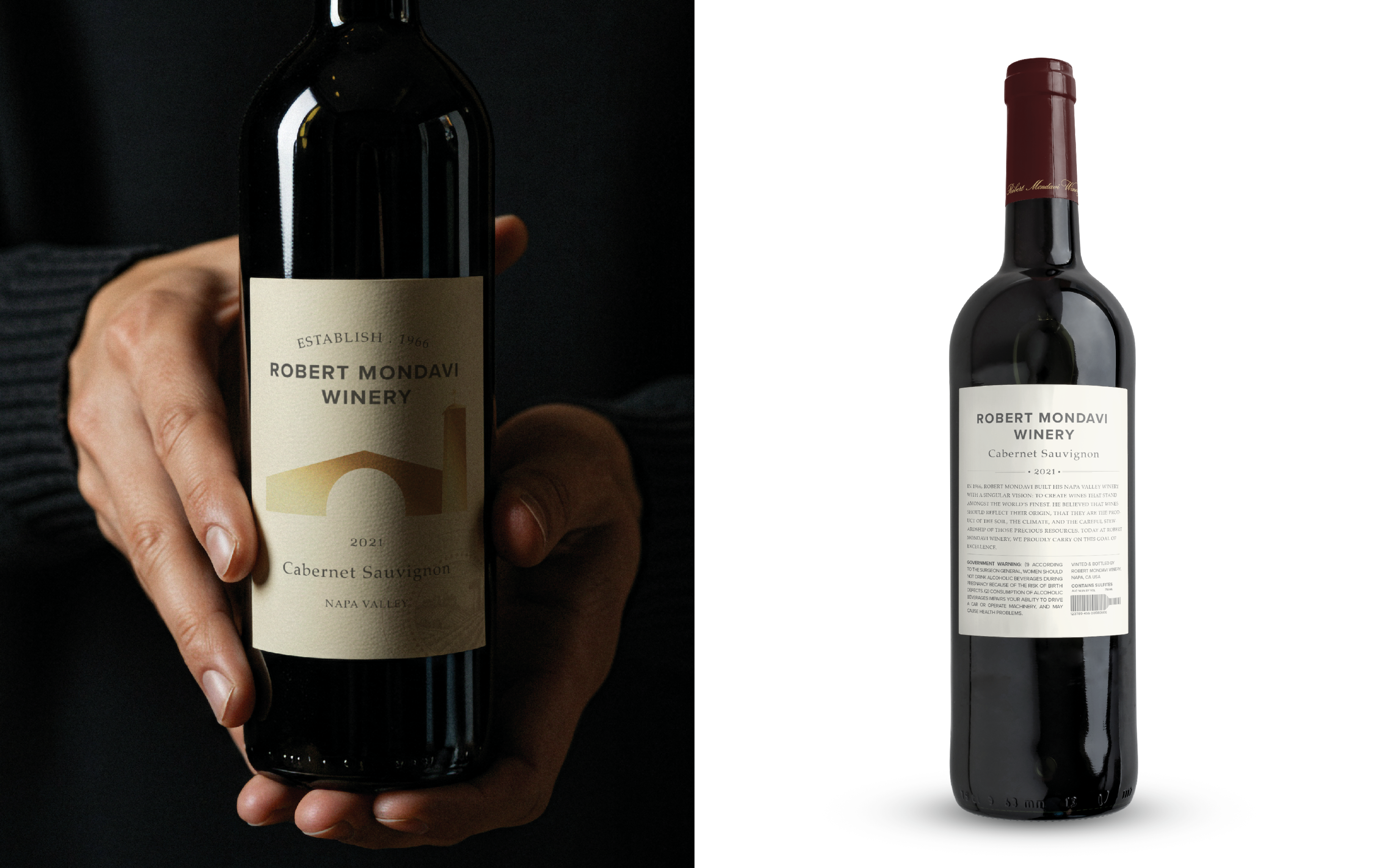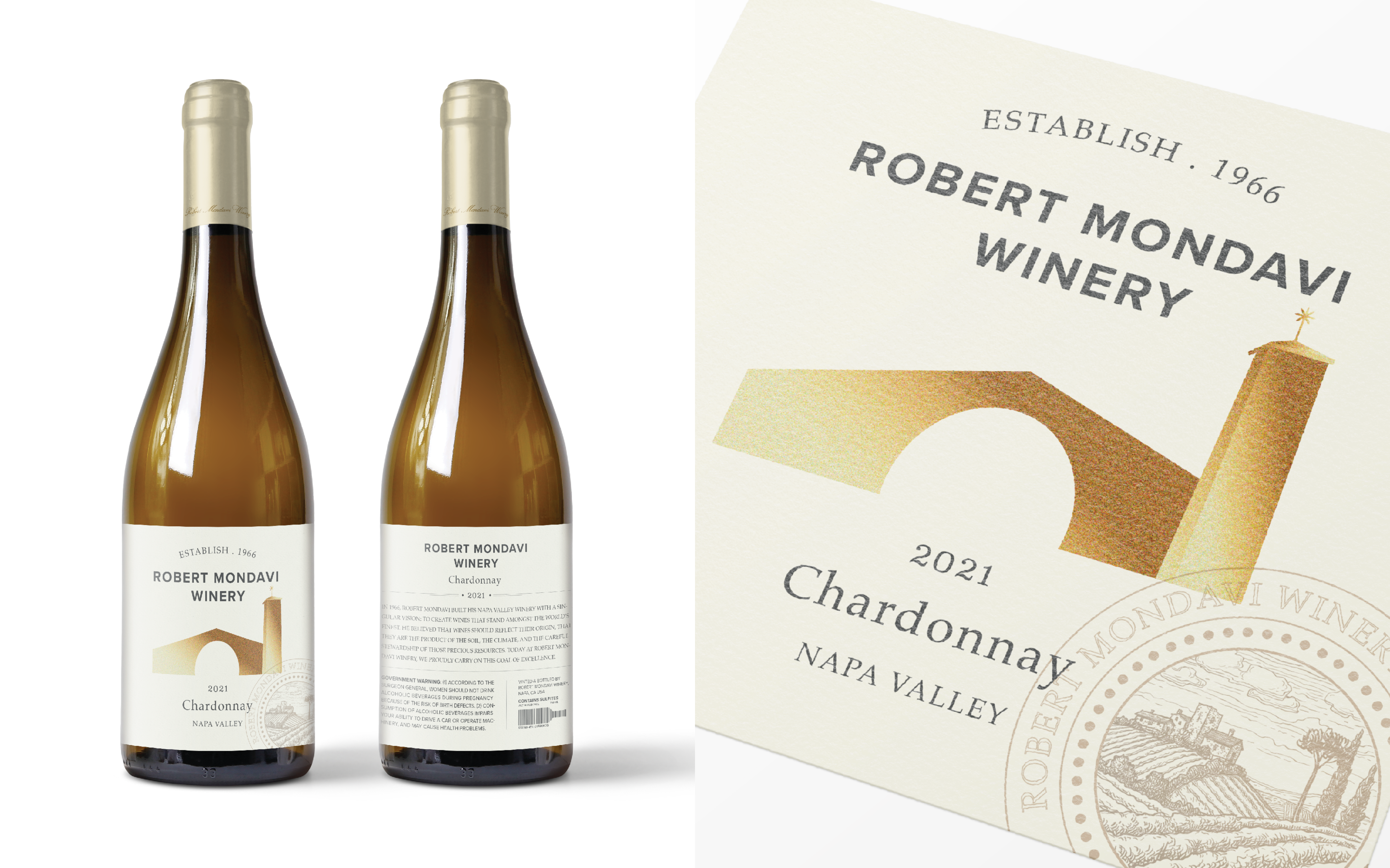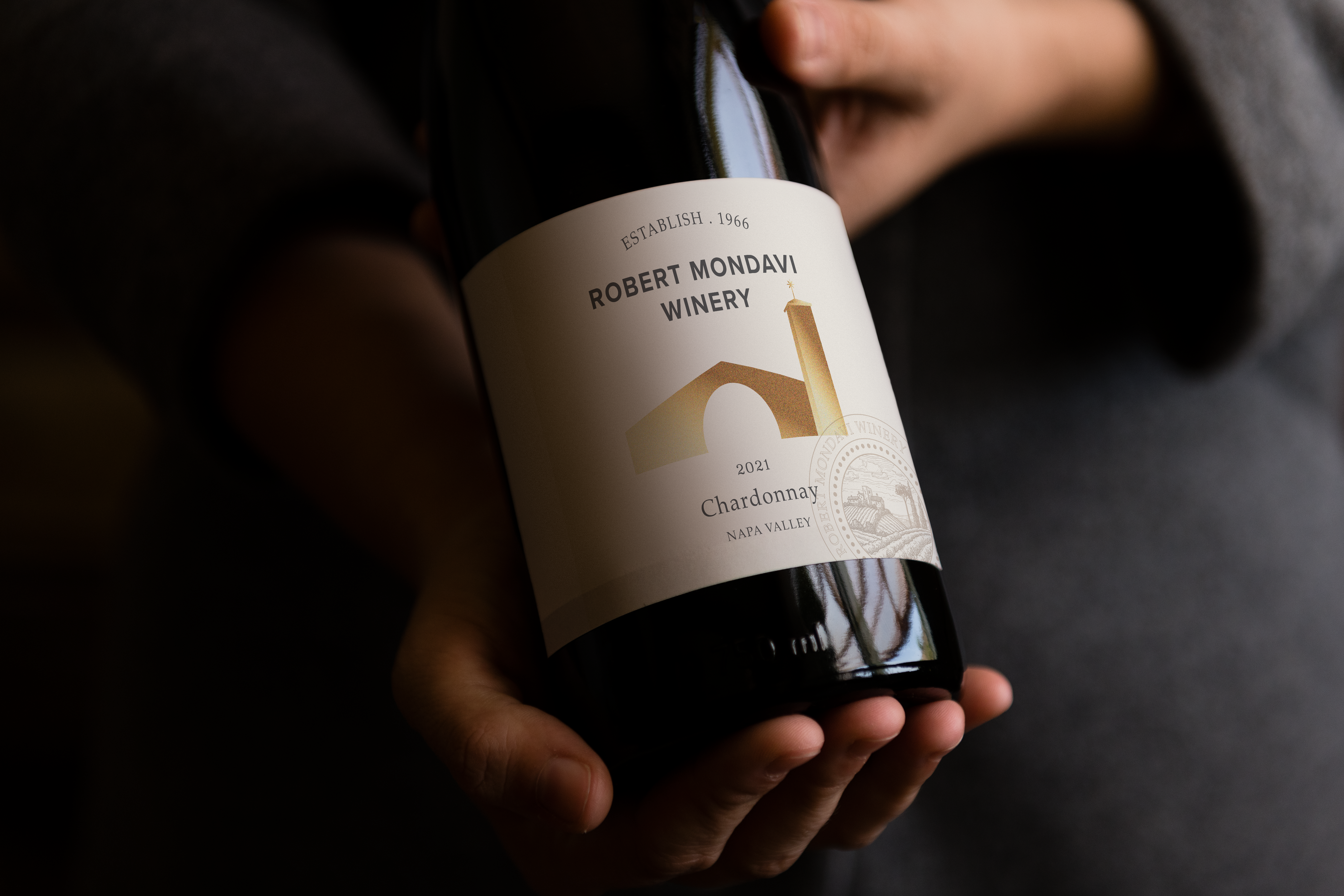
This project involved designing packaging for both high-end and entry-level wines from an existing winery. I chose Robert Mondavi for its legacy and created a tiered system that respects the brand’s heritage and clearly defines its place in the market.
Problem
Many wineries face challenges in distinguishing product tiers without disrupting brand cohesion. Robert Mondavi’s packaging lacked a clear visual hierarchy, making it hard for consumers to quickly recognize pricing and quality while maintaining a sense of connection to the brand’s legacy.
Approach
To address this, I created a cohesive visual system that ensures brand unity through consistent typography, layout, and key motifs. The premium tier uses refined finishes, restrained graphics, and elegant type to convey sophistication. The everyday line shifts subtly in color, texture, and detail to signal accessibility—while both maintain a strong connection to the Mondavi legacy.
MORE WORKS


